
(Not Just) Testing React UI Components with Vitest and Storybook
In my previous article, I focused on building reusable UI components in React. This post continues that topic, with an emphasis on testing.
I have the pleasure of working in web development on both the server and client sides, and I often say that frontend can sometimes be far more unpredictable than backend — and the code can quickly turn into a mess. To reduce the number of headaches, it's important to test our UI code properly. In this article, we’ll explore how to do exactly that.
Unit tests
When talking about testing, it's good to start with unit tests as a little warm-up. The idea is simple — a unit test should be performed on the smallest possible part of the logic, such as a single function.
We will use vitest as the test runner and @testing-library/react to access the React API in tests.
Before we start, let’s create two small utility modules that we'll use in our tests.
typescript
// setup.ts

import "@testing-library/jest-dom/vitest";
import { afterEach, expect } from "vitest";
import { cleanup } from "@testing-library/react";
import * as matchers from "@testing-library/jest-dom/matchers";

expect.extend(matchers);

afterEach(() => {
  cleanup();
});

// test-utils.ts

import { render } from "@testing-library/react";
import { type ReactElement } from "react";

function readFileContent(file: File): Promise<string> {
  return new Promise<string>((resolve, reject) => {
    const reader = new FileReader();
    reader.onload = (e: ProgressEvent<FileReader>) =>
      resolve(e.target?.result as string);
    reader.onerror = (e: ProgressEvent<FileReader>) => reject(e);
    reader.readAsText(file);
  });
}

function customRender(ui: ReactElement, options = {}) {
  return render(ui, {
    wrapper: ({ children }) => children,
    ...options,
  });
}

export * from "@testing-library/react";
export { customRender as render };
export { readFileContent };Now we can move forward and write tests.
Remember the Button component from the previous article, where our journey began?
JSX
import {
  Children,
  cloneElement,
  forwardRef,
  isValidElement,
  type ButtonHTMLAttributes,
  type HTMLAttributes,
  type ReactElement,
} from "react";
import { twMerge } from "tailwind-merge";
import { cva, type VariantProps } from "class-variance-authority";

const Slot = forwardRef<HTMLElement, HTMLAttributes<HTMLElement>>(
  ({ children, ...props }, ref) => {
    if (Children.count(children) > 1) {
      throw new Error("Slot can only have one child");
    }
    const child = children as ReactElement<HTMLAttributes<HTMLElement>>;
    if (!isValidElement(child)) {
      throw new Error("Slot must have a valid child");
    }
    const childProps = child.props;

    return cloneElement(child, {
      ...props,
      ...childProps,
      className: twMerge(props.className, childProps.className),
      ...(ref ? { ref } : {}),
    });
  },
);

const buttonVariants = cva(
  "inline-flex items-center justify-center rounded-md text-sm font-medium transition-colors duration-200 focus-visible:outline-none focus-visible:ring-2 focus-visible:ring-offset-2 cursor-pointer",
  {
    variants: {
      variant: {
        default:
          "bg-gray-900 text-white shadow-sm hover:bg-gray-800 focus-visible:ring-gray-500",
        outline:
          "border-2 border-gray-200 text-gray-700 hover:bg-gray-50 hover:text-gray-900 focus-visible:ring-gray-500",
        link: "text-gray-900 underline-offset-4 hover:underline focus-visible:ring-gray-500",
      },
      size: {
        sm: "px-3 py-1.5 text-sm",
        md: "px-4 py-2 text-sm",
        lg: "px-6 py-3 text-base",
      },
      disabled: {
        true: "opacity-50 cursor-not-allowed",
      },
    },
    defaultVariants: {
      variant: "default",
      size: "md",
    },
  },
);

export interface ButtonProps
  extends ButtonHTMLAttributes<HTMLButtonElement>,
    VariantProps<typeof buttonVariants> {
  asChild?: boolean;
}

export const Button = forwardRef<HTMLButtonElement, ButtonProps>(
  (
    {
      onClick,
      children,
      type = "button",
      className,
      variant,
      size,
      asChild,
      ...props
    },
    ref,
  ) => {
    const Component = asChild ? Slot : "button";
    return (
      <Component
        ref={ref}
        type={type}
        onClick={onClick}
        className={twMerge(buttonVariants({ variant, size, className }))}
        {...props}
      >
        {children}
      </Component>
    );
  },
);In the Button component, we use the asChild pattern. It might be a good idea to test this behavior, as it determines how the user interacts with our button.
Consider a case where we want a file upload input to look like our Button.
So, a basic unit test for this case might look like this:
JSX
import { describe, expect, it, vi } from "vitest";
import { fireEvent, readFileContent, render, screen } from "../../test/test-utils";
import { Button } from "../button";

describe("Button", () => {
    it("functions as a file input", async () => {
        const mockFile = new File(["Hello, World!
This is test content."], "test.txt", {
            type: "text/plain",
            lastModified: Date.now(),
        });

        const handleChange = vi.fn();

        render(
            <Button asChild>
                <input type="file" onChange={handleChange} accept="image/*" data-testid="file-input" />
            </Button>
        );

        const fileInput = screen.getByTestId("file-input");
        expect(fileInput.tagName).toBe("INPUT");
        expect(fileInput).toHaveAttribute("type", "file");
        expect(fileInput).toHaveAttribute("accept", "image/*");

        fireEvent.change(fileInput, {
            target: { files: [mockFile] },
        });

        expect(handleChange).toHaveBeenCalled();
        expect(handleChange).toHaveBeenCalledTimes(1);

        const uploadedFile = (fileInput as HTMLInputElement).files?.[0];

        const content = await readFileContent(uploadedFile!);
        expect(content).toBe("Hello, World!
This is test content.");
    });
});Integration tests
Simple components like our Button usually don’t have many use cases worth testing with unit tests. It’s clear that most user interactions happen across multiple components working together, which is where integration tests come into play. This approach, instead of focusing on the smallest parts of the application, targets the integration of multiple components.
Test component overview
Consider a list component. Each list item has two buttons: one for adding and one for deleting. If the list is empty, a message indicating the empty state is displayed.
JSX
import { Plus, Trash2 } from "lucide-react";
import { Button } from "./button";
import {
    AlertDialogClose,
    AlertDialogConfirm,
    AlertDialog,
    AlertDialogContent,
    AlertDialogDescription,
    AlertDialogTrigger,
    AlertDialogOptions,
} from "./alert-dialog";
import { type ReactNode } from "react";

interface ListItemProps {
    id: number;
    title: string;
    description: string;
    onDelete?: () => void;
}

function Header({ children }: { children: ReactNode }) {
    return <h3 className="font-semibold text-lg text-gray-900 leading-tight mb-2 truncate">{children}</h3>;
}

function Description({ children }: { children: ReactNode }) {
    return <p className="text-gray-600 text-sm leading-relaxed">{children}</p>;
}

export function ListItem({ id, title, description, onDelete }: ListItemProps) {
    return (
        <div
            role="listitem"
            className="w-full bg-white border border-gray-200 rounded-lg shadow-sm hover:shadow-md transition-shadow duration-200"
        >
            <div className="p-4">
                <div className="flex items-start justify-between gap-4">
                    <div className="flex-1 min-w-0">
                        <Header>{title}</Header>
                        <Description>{description}</Description>
                    </div>
                    <div className="flex items-center gap-2 flex-shrink-0">
                        <Button disabled>
                            <Plus className="h-4 w-4 mr-1" />
                            Add
                        </Button>
                        <AlertDialog>
                            <AlertDialogTrigger asChild>
                                <Button
                                    data-testid={`delete-button-${id}`}
                                    className="inline-flex items-center px-3 py-1.5 text-sm font-medium text-white bg-red-600 border border-red-600 rounded-md hover:bg-red-700 hover:border-red-700 focus:outline-none focus:ring-2 focus:ring-red-500 focus:ring-offset-2 transition-colors duration-200"
                                >
                                    <Trash2 className="h-4 w-4 mr-1" />
                                    Delete
                                </Button>
                            </AlertDialogTrigger>
                            <AlertDialogContent>
                                <AlertDialogDescription>
                                    Are you sure you want to delete this item?
                                </AlertDialogDescription>
                                <AlertDialogOptions>
                                    <AlertDialogConfirm onClick={onDelete}>Confirm</AlertDialogConfirm>
                                    <AlertDialogClose>No thanks!</AlertDialogClose>
                                </AlertDialogOptions>
                            </AlertDialogContent>
                        </AlertDialog>
                    </div>
                </div>
            </div>
        </div>
    );
}The ListItem component uses reusable components like Button and AlertDialog. For our example, we will focus only on the deletion action to concentrate on testing user interaction with these components.
The behavior is well known: the user clicks the delete button, and an alert dialog appears with an additional prompt and two button options.
I mentioned the "empty state"; now, let’s define a component for rendering it:
JSX
import { Inbox } from "lucide-react";

export function EmptyState() {
  return (
    <div className="flex w-full flex-col items-center justify-center rounded-lg border-2 border-dashed border-gray-300 bg-gray-50 py-12">
      <div className="flex flex-col items-center justify-center p-4 text-center">
        <div className="mb-4 flex h-12 w-12 items-center justify-center rounded-full bg-gray-100">
          <Inbox className="h-6 w-6 text-gray-500" />
        </div>
        <h3 className="mb-1 text-lg font-medium text-gray-900">
          No items found
        </h3>
        <p className="max-w-sm text-sm text-gray-500">Your list is empty</p>
      </div>
    </div>
  );
}The logic for deletion and state management is handled by the ListExample component.
JSX
import { useState } from "react";
import { ListItem } from "./list-item";
import { EmptyState } from "./empty-state";

type Item = {
    id: number;
    title: string;
    description: string;
};

interface ListExampleProps {
    items?: Item[];
}

export function ListExample({ items }: ListExampleProps) {
    const [itemsData, setItems] = useState<Item[]>(items ?? []);

    const handleDelete = (id: number) => {
        setItems((prevItems) => prevItems.filter((item) => item.id !== id));
    };
    if (itemsData.length === 0) {
        return <EmptyState />;
    }
    return (
        <div className="max-w-4xl mx-auto p-6">
            <h2 className="text-2xl font-bold mb-6">Project List</h2>
            <div className="space-y-4">
                {itemsData.map((item) => (
                    <ListItem
                        id={item.id}
                        key={item.id}
                        title={item.title}
                        description={item.description}
                        onDelete={() => handleDelete(item.id)}
                    />
                ))}
            </div>
        </div>
    );
}Once the user clicks on an item’s delete button, an alert dialog appears. The user can either cancel the deletion or confirm it. If confirmed, the item will be removed from the list. If the list becomes empty, the EmptyState component will be rendered.
Writing tests
With our components defined, we can write tests. We will test a few user scenarios:
- confirming the item deletion action
- canceling the item deletion action
- displaying empty state information after deleting the last item
JSX
import { describe, expect, it } from "vitest";
import { render } from "../../test/test-utils";
import { ListExample } from "../list-example";
import { fireEvent } from "@testing-library/react";
import { ITEMS } from "../../const/listData";

describe("ListExample", () => {
  it("keeps the item when clicking 'No thanks' in alert dialog", async () => {
    const { getByRole, getByText } = render(
      <ListExample
        items={[
          {
            id: 1,
            title: "Test Project",
            description: "This is a test project.",
          },
        ]}
      />,
    );

    const deleteButton = getByRole("button", { name: /delete/i });
    fireEvent.click(deleteButton);

    const cancelButton = getByRole("button", { name: /no thanks/i });
    fireEvent.click(cancelButton);

    expect(getByText("Test Project")).toBeInTheDocument();
  });

  it("deletes the item when confirming in alert dialog", async () => {
    const { getByRole, queryByText, getByTestId } = render(
      <ListExample
        items={[
          {
            id: 1,
            title: "Test Project",
            description: "This is a test project.",
          },
          {
            id: 2,
            title: "Another Project",
            description: "This is another project.",
          },
        ]}
      />,
    );

    expect(queryByText("Test Project")).toBeInTheDocument();
    expect(queryByText("Another Project")).toBeInTheDocument();

    const deleteButton = getByTestId(`delete-button-1`);
    if (!deleteButton) throw new Error("Delete button not found");
    fireEvent.click(deleteButton);

    const confirmButton = getByRole("button", { name: /confirm/i });
    fireEvent.click(confirmButton);

    expect(queryByText("Test Project")).not.toBeInTheDocument();
    expect(queryByText("Another Project")).toBeInTheDocument();
  });

  it("renders empty state after deleting all items", async () => {
    const { getByRole, getByText } = render(<ListExample items={[ITEMS[0]]} />);

    const deleteButton = getByRole("button", { name: /delete/i });
    fireEvent.click(deleteButton);

    const confirmButton = getByRole("button", { name: /confirm/i });
    fireEvent.click(confirmButton);

    expect(getByText("No items found")).toBeInTheDocument();
    expect(getByText("Your list is empty")).toBeInTheDocument();
  });
});Each component has its role and contributes to the overall experience of the ListExample. Testing how those components work together is valuable because it allow us to test real user action scenarios.
But what if we want to see interactions on the screen without running the entire app, or if we are building a design system completely independent from any application? This is where Storybook shines.
Storybook
When developing frontend code, tests that only output results in the terminal are often not enough. UIs are what users see and interact with. Components often not only behave differently but also look different when they receive different props or appear in various layouts. It’s good to have them isolated and be able to easily change their input.
Storybook is a tool that allows developers to build UI components in isolation. Its features facilitate the development process, from creating and debugging to manual and automated testing.
Let’s focus on some Storybook features that can streamline the process of testing and developing UIs.s
Stories & Docs
Stories are an excellent feature for documenting components and testing them manually in isolation. They allow us to test the user experience by interacting with components just as users would. Stories also serve as a place to define the conditions under which the component is rendered, making it easy to create a gallery of the same component in different scenarios.
Let's write the docs for our Button component:
JSX
// components/stories/button.stories.ts

import type { Meta } from "@storybook/react";
import { Button } from "../button";

const meta = {
    title: "Components/Button",
    component: Button,
    parameters: {
        layout: "centered",
        docs: {
            description: {
                component:
                    "A versatile button component that supports multiple variants, sizes, and can be rendered as other elements.",
            },
        },
    },
    tags: ["autodocs"],
    argTypes: {
        variant: {
            control: "select",
            options: ["default", "outline", "link"],
            description: "The visual style of the button",
        },
        size: {
            control: "select",
            options: ["sm", "md", "lg"],
            description: "The size of the button",
        },
        disabled: {
            control: "boolean",
            description: "Whether the button is disabled",
        },
        asChild: {
            control: "boolean",
        },
        children: {
            control: "text",
        },
    },
} satisfies Meta<typeof Button>;

export default meta;
type Story = StoryObj<typeof Button>;One of the things we should do is document our component. In the era of AI coding editors like GitHub Copilot, Cursor, and others, adding documentation is mandatory. You can simply generate the documentation and quickly review it. This will be especially helpful for your team if the component is complex.
The API of Storybook’s Docs is intuitive and easy to understand.
The result of the code above looks quite neat:
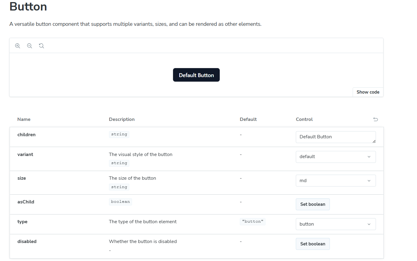
We can visually inspect our component, interact with it, and dynamically change its props using controls. Any changes to the component are instantly reflected in the preview.
Alright, we have the docs — now let’s define stories for our component:
JSX
/* ----- */

export const Default: Story = {
    args: {
        children: "Default Button",
        variant: "default",
        size: "md",
    },
};

export const Link: Story = {
    args: {
        asChild: true,
        children: <a href="/">Link as Button</a>,
        variant: "link",
        size: "md",
    },
};

export const Upload: Story = {
    args: {
        asChild: true,
        variant: "outline",
        children: <input type="file" id="fileUpload" name="fileUpload" />,
    },
};

export const WithIcon: Story = {
    args: {
        children: (
            <>
                <svg
                    className="mr-2 h-4 w-4"
                    fill="none"
                    stroke="currentColor"
                    viewBox="0 0 24 24"
                    xmlns="http://www.w3.org/2000/svg"
                >
                    <path strokeLinecap="round" strokeLinejoin="round" strokeWidth={2} d="M4 8h16M4 16h16" />
                </svg>
                Menu
            </>
        ),
    },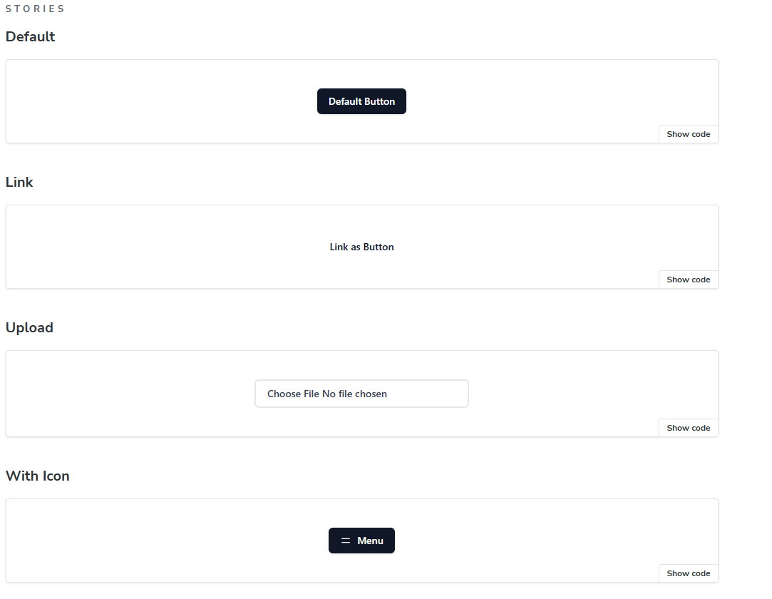
};Stories are objects that describe the appearance and behavior of our component. Defining a story is like calling the component with specific props. It is very useful, especially in the case of our Button, to test how it looks and behaves when using the asChild pattern.
Each exported story will be available in the Docs tab, in the "Stories" section under the main component section:
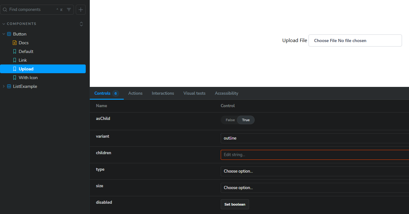
But to interact with each of them separately, we need to go to a dedicated view accessible via the navigation.
Let's choose the "Upload" story of the Button:
Developing with stories helps developers catch many bugs early. It’s similar to developing with TypeScript — you can catch issues before even running your app’s code.
Let's play with Storybook's automated tests
There is no doubt that stories are a powerful tool, but to complete the testing workflow, we need automation. Fortunately, Storybook gives us the ability to write automated tests. This feature is available via play function that we can define in our stories.
Let’s switch to our ListExample component and write tests for it.
JSX
import { ITEMS } from "../../const/listData";
import { screen } from "storybook/test";

/* ----- rest of stories ------  */


const ClickOnDelete: Story = {
    play: async ({ canvas, userEvent }) => {
        const deleteButton = canvas.getAllByRole("button", { name: /delete/i })[0];
        await userEvent.click(deleteButton);
    },
};
const ClickOnConfirm: Story = {
    play: async ({ userEvent }) => {
        const confirmButton = screen.getByText("Confirm");
        await userEvent.click(confirmButton);
    },
};

const ClickOnReject: Story = {
    play: async ({ userEvent }) => {
        const rejectButton = screen.getByText(/no thanks/i);
        await userEvent.click(rejectButton);
    },
};As you can see, some code patterns and test syntax are similar to what we already know. Test cases are included within stories.
The stories we defined above are reusable steps that reflect the testing process. These initial three stories are intentionally not exported because we don’t want them to appear in the navigation—they are used only as reusable, composable parts for the integration tests below:
JSX
import { ITEMS } from "../../const/listData";
import { expect, waitFor } from "storybook/test";

/* ----- rest of stories ------  */


export const WithDeleteInteraction: Story = {
    args: {
        items: ITEMS,
    },
    play: async ({ context, canvas, step }) => {
        await step("Render List", async () => {
            await expect(canvas.getByText("Project Alpha")).toBeInTheDocument();
        });

        await step("Delete first item", async () => {
            await ClickOnDelete.play(context);
        });

        await step("Confirm deletion", async () => {
            await ClickOnConfirm.play(context);
        });

        await step("Verify deletion", async () => {
            await waitFor(() => {
                expect(canvas.queryByText("Project Alpha")).not.toBeInTheDocument();
            });
        });
    },
};
export const WithRejectedDeletionOperation: Story = {
    args: {
        items: ITEMS,
    },
    play: async ({ context, canvas, step }) => {
        await step("Render List", async () => {
            await expect(canvas.getByText("Project Alpha")).toBeInTheDocument();
        });

        await step("Delete first item", async () => {
            await ClickOnDelete.play(context);
        });

        await step("Reject", async () => {
            await ClickOnReject.play(context);
        });

        await step("Verify deletion", async () => {
            await waitFor(() => {
                expect(canvas.queryByText("Project Alpha")).toBeInTheDocument();
            });
        });
    },
};

export const WithDeleteLastItem: Story = {
    args: {
        items: [ITEMS[0]],
    },
    play: async ({ context, canvas, step }) => {
        await step("Render List", async () => {
            await expect(canvas.getByText("Project Alpha")).toBeInTheDocument();
        });
        await step("Delete first item", async () => {
            await ClickOnDelete?.play(context);
        });

        await step("Confirm deletion", async () => {
            await ClickOnConfirm.play(context);
        });

        await step("Verify empty state", async () => {
            await waitFor(() => {
                expect(canvas.getByText("No items found")).toBeInTheDocument();
                expect(canvas.getByText("Your list is empty")).toBeInTheDocument();
            });
        });
    },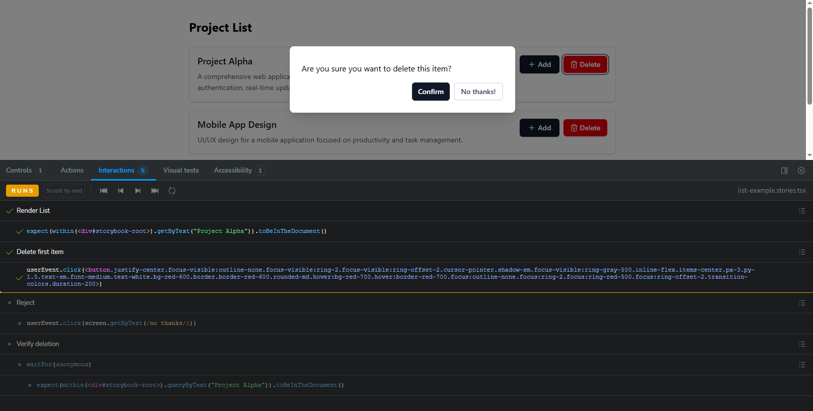
};And here we define our interaction tests that ensure the component works as expected.
The syntax and patterns used here are well known, so every developer can quickly start writing tests in Storybook stories. Additionally, the labels passed to the step function make the code understandable and self-explanatory. We can easily infer which steps will be tested and also see how the components behave live.
At the bottom of the preview, we can find a tab called "Interactions" that allows us to go through each defined case manually or play them from the start.
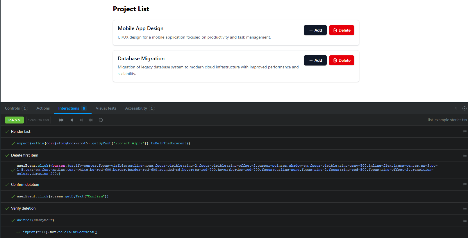
We can interact with this list by jumping to a specific step. The state of the component will also be visually reflected in the preview.
Accessibility testing
Accessibility is very important when developing UIs, so testing it is also crucial. Storybook provides a tool that automatically scans our components and shows the results of those tests below the component preview:
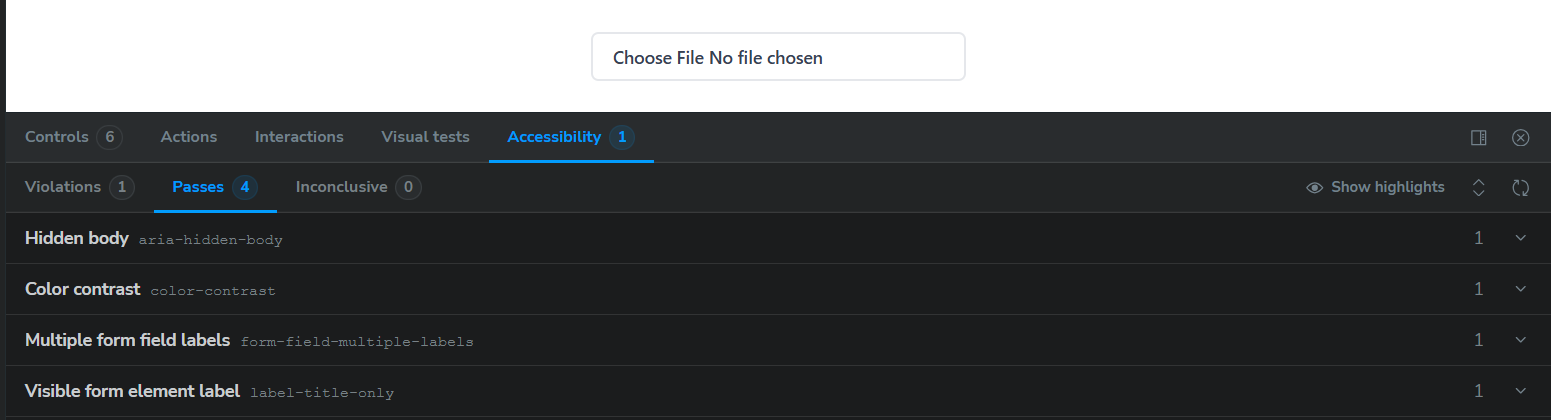
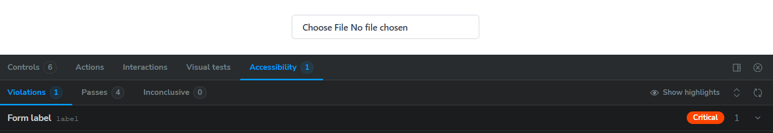
As you can see, for our Button used as an upload control, some tests have passed, while some violations have also been detected.
Such feature can be a great starting point for detailed accessibility testing.
Sharing
With Storybook, we can even share our design system. Sharing the progress of work is very important for stakeholders and people on the business side. In conversations about business requirements, clear examples and visible outcomes are key to preventing misunderstandings, which makes iterations faster and more effective.
Storybook offers decent sharing capabilities, such as building and publishing it as a static web app or integrating with Figma.
Final Thoughts
Testing and building with the right tools can save us a lot of time. Moreover, imagine developing design systems with strong involvement from AI agents and testing them in Storybook — it's a powerful combo, isn't it? With a properly configured testing environment, we can focus on solving real business problems without spending an excessive amount of time fixing bugs. However, remember that Storybook is not always the best choice. Sometimes, using it in smaller projects can be overkill—the same applies to unit tests or integration tests. When your application is small or is just a static website, it can be faster and still safe to test manually or only with end-to-end tests.
When I was planning this article, I was lucky to find a great episode of the Syntax podcast featuring one of the Storybook team members. If you want to learn about Storybook from its team’s perspective, it’s definitely worth a listen.
PS: Syntax is my favorite web development podcast.
Thanks for exploring this topic with me! Stay tuned!
PS: If you want to try out the code from this article, check out this GitHub repo.